gdi

Intermediate HTML/CSS & Intro to Responsive Design

Welcome!

Wifi Info

Network: GoogleGuest

No Password

Thanks to our host:


Google logo

Welcome!

Girl Develop It is here to provide affordable and accessible programs to learn about web development, design, and research through mentorship and hands-on instruction.


Some "rules":


  • We are here for you!
  • Every question is important
  • Help each other
  • Have fun

Thank you to our TAs today:


Tracey & Lynn

And our organizer:


Kalene

Now it's all about you!


  • Tell us who you are.
  • What do you hope to get out of this class?

What we'll be covering in this class

We'll be jumping into HTML/CSS right where the beginner class left off.

We will not be going over the previous class, we just don't have the time!

Get Started: Sublime Text 2

We'll be using Sublime Text 2 in class today.


  1. Download ST2 from: www.sublimetext.com/2

Class workshop files and slides are available at:


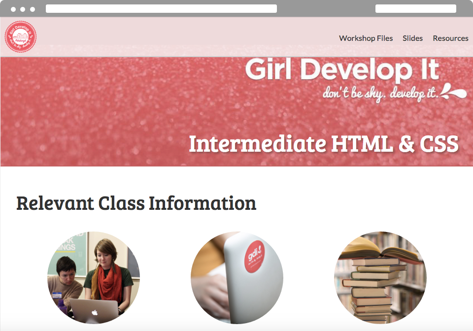
http://silverli.github.io/intermediate-html-css/

Download the files and follow along with the slides!

We will be building a profile site from scratch

today's project

Workshop files

Workshop files

  • We have provided a folder that contains sample images for you to use today. We encourage you to be creative so don't feel like you're restricted to these images
  • We've also included an index.html with the basic structure of the website we'll be working on, a teacher.html that has code for the class site you can refer to, and a blank.html file.

Folder Structure

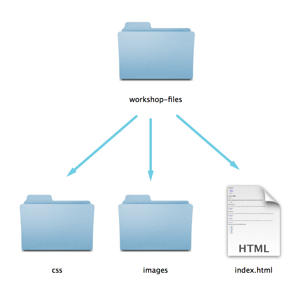
We've set up the folder structure for the site today to reflect commonly used practices.

folder structure

Common Applications

Common Applications

So how do people use HTML/CSS?

  • For everything
  • HTML is the structure of a web page
  • CSS is how we style that underlying structure
  • CSS is also how we control what a page looks like on different screen sizes (mediaqueries)

Here's a few things we'll be covering today:

  • Semantic HTML structure
  • Responsive Design
  • Horizontal & fixed navigation
  • Heros with full bleed background images
  • Border-radius on images & elements
  • Custom font-faces
  • Three column layouts
  • CSS Animations
  • Using SVG

Let's Develop It

  • Draw a wireframe of the desktop and mobile view of what you'd like your profile site to look like
  • Remember to include some of the following elements:
    • What you'd like in your navigation
    • What picture/or anything you'd like across the top
    • What should go in your three column layout (text, pictures, images, a combo?)
    • Your footer

HTML5

HTML 5: What is it?

Formally, HTML5 is the W3C’s specification for the next version of HTML.

Informally, people use "HTML5" to refer to a whole set of new web standards and abilities:

  • HTML5
  • CSS3
  • JavaScript

Quick History of HTML5

  • 2004:"WHAT" Working group formed. (WHATWG)

    Members from Apple, Mozilla, & Opera set out to develop HTML5.

  • 2008:First verson of HTML5 published

    First draft is written, but changes are still coming. HTML5 is continually evolving.

  • 2008:Firefox 3 becomes HTML5 compatable.
  • Jan. 2010:YouTube now offers HTML5 video player.

Okay, not that quick history of HTML5

  • April 2010: Steve Jobs trashes Flash & bans it on all Apple devices in favor of HTML5.
  • Dec. 2010: Chrome opens HTML5 web store.
  • Sept. 2011: 34% of top 100 sites use HTML5
  • Sept. 2012: WC3 proposes stable release of HTML5 by end of 2014!
  • Oct. 2014: Final and complete!

What about the browsers? (2015)

Percentage of HTML5 Elements supported:

  • Chrome 43: 95% supported
  • Opera 29: 94% supported
  • Firefox 38: 84% supported
  • Safari 8: 71% supported
  • Internet Explorer 11: 60% supported

So what's so cool about it?

Too much to cover in our time together

But here are some highlights:

Marks some old things obsolete

Examples
  • More semantic, structural elements (helps with clarity, accessibility)
  • Deprecated items (e.g. frame, frameset, noframes)
  • Presentational elements and attributes replaced by CSS (e.g. font, big, center)
Reference

Redefines a few things

Gives some old elements semantic meaning and separates them from presentation (e.g. b, i, strong, em)

  • i: now about alternative voice (different language, technical)
  • b: offset text
  • em: stress emphasis
  • strong: strong importance (not that different)

HTML5 Doctype


<!DOCTYPE html>
        

Minimum information required to ensure that a browser renders using standards mode

Old Doctypes


<!DOCTYPE HTML PUBLIC "-//W3C//DTD HTML 4.01//EN"
"http://www.w3.org/TR/html4/strict.dtd">

<!DOCTYPE html PUBLIC "-//W3C//DTD XHTML 1.0 Strict//EN"
"http://www.w3.org/TR/xhtml1/DTD/xhtml1-strict.dtd">
        

New Semantic, Structural Elements

<header>

  • Container for a group of introductory or navigational aids
  • Document can have multiple header elements
  • E.g. one for the page, one for each section

<nav>

  • Contains major navigational information
  • Usually a list of links
  • Often lives in the header
  • E.g. site navigation

<main>

  • Contains main content
  • Usually a list of links
  • Often lives in the header
  • E.g. site navigation

<section>

  • Groups together thematically related content
  • Similar to prior use of the div, but div has no semantic meaning

<aside>

  • Tangentially related content
  • E.g. sidebar, pull quotes

<article>

  • Self-contained related content
  • E.g. blog posts, news stories, comments, reviews, forum posts

<footer>

  • Contains information about its containing element
  • E.g. who wrote it, copyright, links to related content, etc.
  • Document can have multiple footer elements
  • E.g. one for the page, one for each section

The Canonical Structure:


                    <html>
                        <head></head>
                        <body>
                            <header>
                                <nav></nav>
                            </header>
                            <main>

                                <section></section>
                                <article></article>
                                <aside></aside>

                            </main>
                            <footer></footer>
                        </body>
                    </html>
                

Let's Develop It

  • Use semantic HTML elements to layout your site in index.html (header, nav, main, section, footer)
  • Refer to the teacher.html page for hints
  • Think about your wireframes!

Standard Practices

Standard Practices

  • Reset CSS files
  • Standard widths and sizes
  • Containers for layout

Reset CSS

Some HTML elements have default styles

Different browsers display these things differently. A reset gets rid of these inconsistencies and lets you start from fresh.

Defaults include:

  • Bulleted lists like this one have standard bullets
  • Paragraphs, headings, & many other elements have default padding
  • Links are blue and underlined

Reset CSS

Most elements:

  margin: 0;
  padding: 0;
  border: 0;
  font-size: 100%;
  font: inherit;
  vertical-align: baseline;
Lists:

  list-style: none;

Reset CSS

We've done all the hard work for you! Instead of typing this out - we've included this in the reset.css file.

Feel free to use this file on any and all projects you start in the future!

Standard widths and sizes

  • Screen sizes vary from computer to computer. Make your site look great on different screen sizes by defining specific widths, or using percentages, or ems.
  • Wrap your content in containers to control its max width.
  • Keep in mind screen sizes also mean different font size display.
  • Retina screens have a higher pixel density and a larger resolution, so fonts appear smaller.

Fixed vs. Fluid Width pages

Fixed

  • Fixed websites have a set width for the wrapper, usually 960px to 1024px.
  • The elements inside the wrapper have a set width, or percentage of the wrapper width.
  • No matter the screensize, the user always sees the same size site.
  • Example: http://www.smartdentalva.com/

Fixed vs. Fluid Width pages

Fluid

  • Also referred to as a liquid layout.
  • Majority of the components, including the wrapper, have percentages or ems (relative font sizes) for their widths.
  • The layout adjusts for the width of the user's screen resolution.
  • Sounds like a responsive site right!? You're right!
  • Example: http://www.sweetmagnoliagelato.com/flavors/

Containers

Wrappers are a good way to center content if the screen width is wider than your content.


  .container {
      width: 100%; /* take up full viewport width */
      max-width: 1400px; /* if viewport is larger than 1440px, 
                            don't let it take up 100% */
      margin: 0 auto; /* center content in the viewport */
  }
  • 1. The container will take up 100% of the screen if the width of the viewport is less than 1440px.
  • 2. If the viewport is wider than 1440px, it will reach it's max width, and become centered in the viewport.

Let's Develop It

  • Put some containers in your index.html where you'd like to restrict how wide content can get
  • You can copy the code from the last slide, and/or modify it
  • Think about your wireframes!

Horizontal Fixed Nav

All the cool kids are doing it

  • Horizontal fixed-to-top nav allows users to have access to navigational elements at all times
  • All the rage these days
  • Be careful - screen heights vary, and it reduces the amount of content visible on smaller screens

Fixed Nav: HTML

Let's include it in a header, since we know we'll be grouping related content here.


Fixed Nav: CSS

Remember, using fixed position is like using absolute position, except that it's fixed to the viewport, not the containing element.

We also have to define a width for it, and its location.


nav {
    position: fixed;
    top: 0;
    left: 0;
    background: #fafafa;
    border-bottom: 2px solid #ccc;
    height: 70px;
    width: 100%;
}

Fixed Nav: CSS

Because we've fixed the nav to the top of the viewport, we need to bump the content of the body down to be visible to the user.

This should be the same, or more than, the height of the navigation bar.


body {
    padding-top: 70px;
}
nav {
    position: fixed;
    top: 0;
    left: 0;
    background: #fafafa;
    border-bottom: 2px solid #ccc;
    height: 70px;
    width: 100%;
}

Fixed Nav: CSS

Now we need to get those list items next to each other instead of stacked.

Let's float them to the left and add some padding to the links so they have a large clickable area.

nav {
    position: fixed;
    top: 0;
    left: 0;
    background: #fafafa;
    border-bottom: 2px solid #ccc;
    height: 70px;
    width: 100%;
}
nav li {
    float: left;
    width: auto;
}
nav li a {
    padding: 25px 10px;
    display: block;
}

Fixed Nav: Adding a brand

We can use an H1 with text replacement to include a brand, or logo, in the corner that will still work if images are turned off, making it accesible to screen readers.


Fixed Nav: Text replacement & H1s

#brand {
    color: transparent;
    background: url(../images/z.png) no-repeat top left;
    height: 60px;
    width: 60px;
    float: left;
    margin: 5px;
} 
nav ul {
    float: right;
    width: auto;
}   

Why Text Replacement?

  • If we turn the CSS off for this page - the title will still be visible to the browser.
  • If a user is coming to our site with a screen reader - the title of the site will be readable to them
  • Search engines ♥ it!

Fixed Nav: Container

Notice how the edge of the nav bumps up against the edge of the browser? Let's fix that by adding a container around it.


Fixed Nav: Container

Let's give the container a fixed width and see what happens.

.container {
    width: 1024px;
    margin: 0 auto;
}

Now wherever we use .container it will be 1024px wide and centered.

Develop It!

Let's make some small tweaks to the navigation

  • Remove the underlines on the links with text-decoration
  • Change the color of the links
  • Try adding a background color on hover

Hero Section

What is a Hero?

  • Large banner image, prominently placed on a web page, generally in the front and center
  • First visual a visitor encounters on the site and its purpose is to present an overview of the site's most important content
  • Often consists of image and text, can be static or dynamic

Hero Examples

today's project

Hero: HTML

Our Hero section should look a little something like this:

<section class="hero">


Intermediate HTML & CSS

</section>

Hero: CSS

.hero {
    position: relative;
    margin-top:15px; /*this will depend on the height 
    of your fixed nav*/
}
.hero img {
    width: 100%;
}

But why's the text outside our image?...

It's all about position

  1. We need to use position absolute to get the text to appear inside the relative parent
  2. We also need to use top/right/left/bottom attributes to get the text to appear where we want

Positioning: CSS

This will put your text to the right and bottom of the hero

.hero h2 {
    position: absolute;
    bottom: 25px;
    right: 30px;
}
                

Positioning: CSS

This will put your text in the center of the hero

.hero {
    position: relative;
    text-align: center;
}

.hero h2 {
    position: absolute;
    left: 0;
    right: 0;
}

Border Magic

Turning squares into circles with magic!

Okay, it's not really magic, it's just a bit of CSS3.

Border-Radius

Simply put, allows you to create rounded corners on boxes.

Designers rejoice!

Border-radius

20px radius on all corners

#hero img {
border-radius: 20px;
}

Border-radius

10px radius on top left & bottom right

40px on top right & bottom left

#hero img {
border-radius: 10px 40px;
}

Border-radius

10px radius on top left

20px radius top right

40px radius bottom right

80px radius bottom left

#hero img {
border-radius: 10px 20px 40px 80px;
}

Border-radius

50% radius on all corners

#hero img {
border-radius: 50%;
}

Let's Develop It!

Put some border radius on anything!

You could put it on an:

  • Image
  • Button
  • Border around anything!

Vendor Prefixes

Vendor Prefixes

HTML5 and CSS3 are still new!

This is great, but it means that not all browsers treat new CSS3 properties the same

Vendor Prefixes

Flags it as a work-in-progress

When finished, the browser should support the non-prefixed name

Vendor Prefixes

Each browser has their own:

  • Chrome:-webkit-
  • Firefox:-moz-
  • Safari:-webkit-
  • Opera:-o-

Using Prefixes

#hero img {
-moz-border-radius: 50%;
-webkit-border-radius: 50%;
-ms-border-radius: 50%;
-o-border-radius: 50%;
border-radius: 50%;
}

Order matters! The non-prefixed version should always go last.

NOTE:

While you should always use the vendor prefixes when writing code, today we're just going to use the non-prefixed property.

This is to save time during the code exercises

3-column Content Area

Why 3 columns?

Because it's a comfortable width for readability.

And because 3 is a pleasing design construct.

3 Column: HTML

Our code should look something like this:

<main class="main-content">
    

...

<section class="column"> ..content here... </section> <section class="column"> ..content here... </section> <section class="column"> ..content here... </section> </main>

3 Column: CSS

Now that we have our 3 columns, we want them to appear next to each other. We can do this by floating them all left.

.column {
    float: left;
    width: 30%;
    padding-right: 2.5%;
}

.column:first-of-type {
    padding-left: 2.5%;
}        
  • Don't forget padding (or margin) to give the columns some space.
  • This layout should add up to 100% with column width+padding

Wow. Large Images.

Images won't scale with the columns, because they ignore constraints like div width, unless you tell them to do so.

.column img {
    width: 90%;
    max-width: 90%;
}

There we go!

3 Column: Container

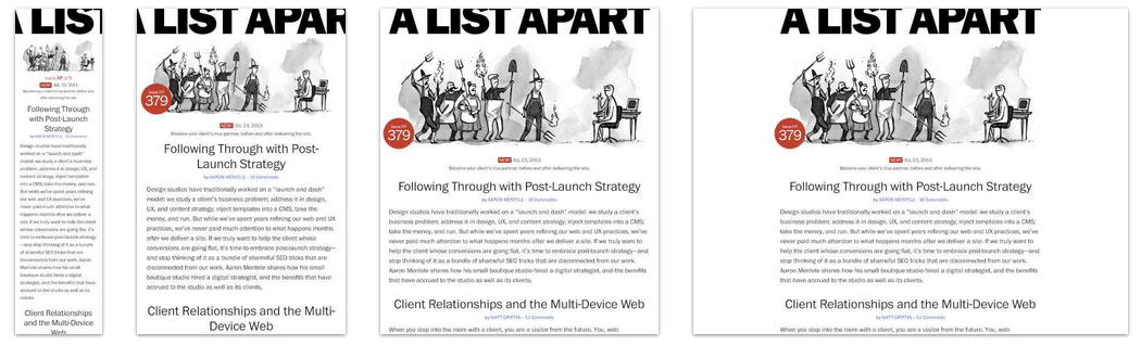
We've got our 3 column layout set, our images are scaled based on the width of the column, but our columns are still bumping against the edges of the browser.

<section id="main-content">
    

...

<section class="column"> ... </section> <section class="column"> ... </section> <section class="column"> ... </section>
</section>

Adding the container, which we already defined the width of, makes everything line up.

Develop It!

Let's play around with these columns a bit more:

You could:

  • Adjust the font size of the main header of the content area
  • Adjust the font size of the headers in the columns - try changing their colors too
  • Add a border to the images to make them stand out a bit more

Responsive Web Design (RWD)

What is it!?

RWD is a design approach that suggests that the design & development of a site shoud respond to the user's behavior and environment.

responsive design

Wait, people really care?

  • 91% of U.S. Citizens have their smart phone within reach 24/7
  • Smartphone users check their phones 150x every day
  • 25% of mobile users in the U.S. don't even own a laptop or desktop

Why it's awesome

RWD modifies the presentation of a site, without modifying the content of the page. So no matter what, every user has access to the same information.

responsive example

How did we get here?

  • In 2010, Ethan Marcotte coined the tearm in an article on A List Apart
  • In 2011, he wrote the book on it (literally), called: "Responsive Web Design"
  • In 2012, RWD was the #2 trend in web design
  • 2013 was called "The Year of Responsive Web Design" because it was and still is a cost effective alternative to mobile apps

The Ingredients of RWD

  • A Flexible foundation
  • Fluid grids
  • Flexible images
  • CSS Media Queries to make the magic happen

Fluid Grids

With fixed-width sites, we have to adjust the height and width of elements manually.

With fluid grids, the height and width of elements is dependent upon the device resolution.

How they work

  • First, we define a maximum width for the container
  • Then, we divide the content up into a set of columns, usually 12
  • Then, we design elements with proportional widths and heights instead of being stuck with specific pixel dimensions
  • Whenever the device width changes, the grids change in width to scale with the device

Flexible images

Text scales easily on smaller devices, but images are a bit tricky.

Images will overflow their container elements if they're too big for them.

That's annoying.

Enter max-width

By using max-width on images, they will only expand to the size of their parent.

If their parent has no width, it will just expand to the width of the viewport.

img {
  max-width: 100%;
}

Media Queries

Media queries apply certain CSS in certain situations.

  • Print Media
  • iPhone
  • iPad
  • Even larger screens

Include Media Queries Last

They will overwrite previous styles because they are last in the cascade.

Writing Media Queries

I prefer to just think about max-width (get's too confusing, and that way, we're thinking mobile first)


@media only screen and (max-width : 480px) {
/* Styles */
}

For screens that are under 480px


@media only screen and (max-width : 1024px) {
/* Styles */
}

For screens that are under 1024px

How they work

Rather than looking for a type of device, they look at the capability of the device. You can use them to check for all sorts of things.

  • Width & height of the viewport
  • Width & height of the device
  • Orientation - landscape or portrait
  • Resolution - retina or normal

Mobile First

By designing sites with mobile first in mind, it makes scaling them down a lot easier.

Mobile first allows us to simplify the user flow to its basic elements and then enhance it as the screen size increases.

iPhone:

Tablet

Desktop

Viewport Meta

Use this to control the size of the viewport.

<meta name="viewport" content="width=device-width, 
user-scalable=true;">

Width=device-width makes the viewport the size of the device.

User-scalable=true allows the user to pinch and zoom on your site.

Luckily, we've already added this for you!

Let's develop it!

  • Let's take a look at our site while resizing the browser, and find ways to improve it.
  • Let's get that three column layout to change to a one column layout at smaller widths.
  • Use media queries to shift other elements around on the page and to increase legibilty at different screen sizes.

SVG Graphics

SVG Graphics

Scalable Vector Graphics

Designers everywhere have always wanted to use vector based graphics on their sites because of their quality.

Well now you can!

It's not that new really

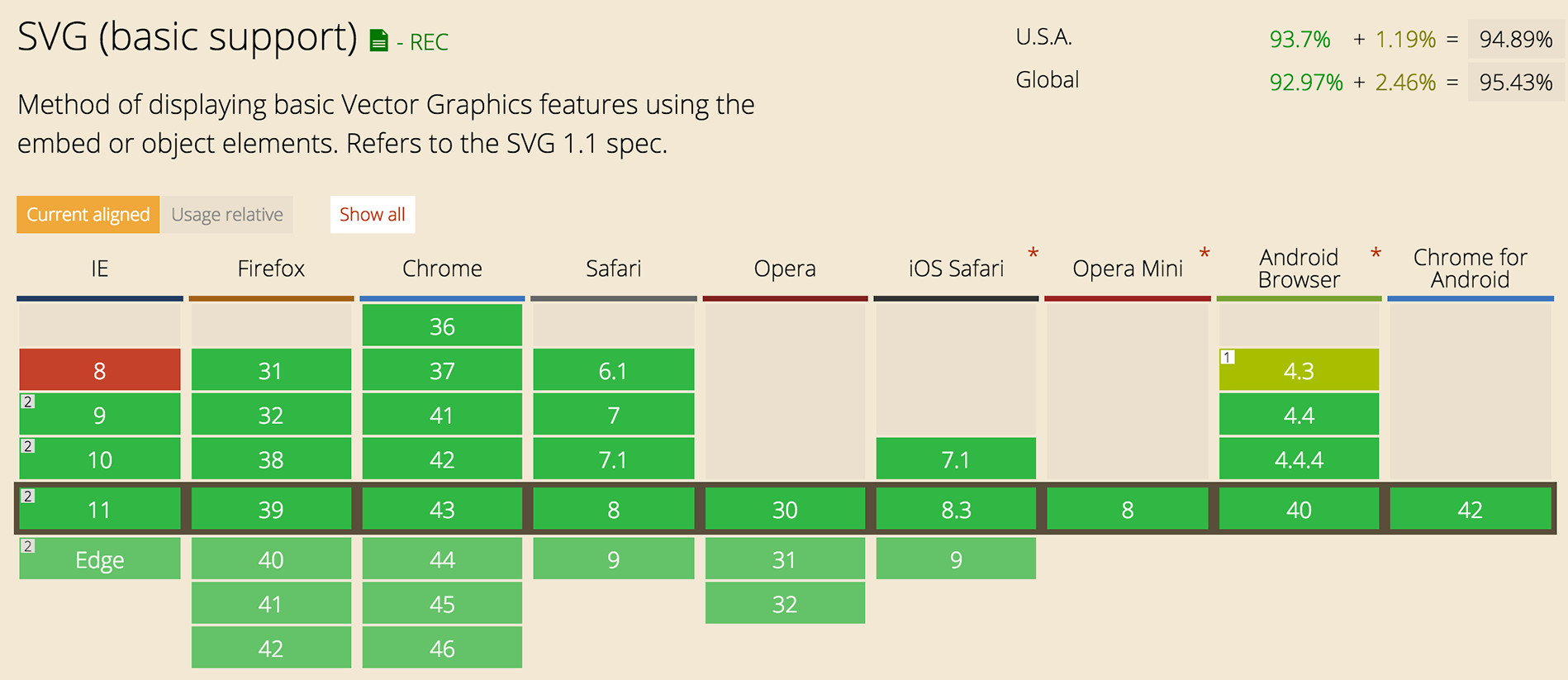
It's been a W3C (World Wide Web Consortium) standard since 1999

In recent years browsers are becoming more and more compatable with SVG graphics.

Once upon a time, .png graphics weren't supported in browsers, soon the world will know about SVG!

How to use SVG today

Use Adobe Illustrator, or other vector program, to create a high quality image.

Save it as a .svg file.

Save a high res .png image as a fallback.

Include SVG

Use SVG as an image:

<img src="image.svg" alt='Cat'>

Use SVG as a background image:

HTML:

<a href="/" class="logo">
  GDI
</a>

CSS:

.logo {
  display: block;
  width: 100px;
  height: 82px;
  background: url(image.svg);
  background-size: 100px 82px;
}

Or:

Inline SVG

<section 
    <svg>
        <g class='twitter'></g>
    <svg>
</section>
                    

You'll need to add a class to the g element. (We'll talk about that in a moment).

Why use inline?

Changing SVG attributes in CSS!:

Rather than going into illustrator to change colors and borders of SVG, you can do it in CSS!

Some attributes:

  • fill: color;
  • stroke: color; (this just means border)
  • stroke-width: number;

Browser Support

Our favorite topic - Internet Explorer

SVG support

Chris Coyer has written an amazing article with tons of work arounds for IE8.

SVG Social Icons

Now that we know how awesome SVG graphics are, let's use them in our footer section.

We've included facebook, instagram, linked in, and twitter svgs in your images folder

Let's Develop It!

  • Let's place these svgs inline in image tags
  • And then place those images in an unordered list in the footer (it's just good practice to use a list)
  • Style away! Use fill, stroke attributes in CSS to make these icons fit with your theme!

@font-face

@font-face

The world of HTML has progressed beyond Times New Roman and Arial

Yay!

How do we use new and cool fonts?

Class, meet Google Web Fonts

Google has hundreds of free, open-source fonts that have been optimized for the web, and ready for us to use!

The service runs on Google's servers which are fast, reliable and tested. Google provides this service free of charge.

www.google.com/fonts

@font-face

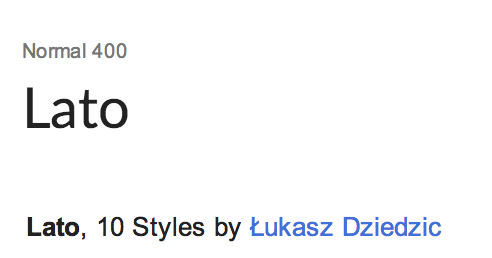
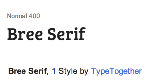
In our example, we've used Lato for the body and Bree Serif for the headlines

You can use any font you'd like!

lato bree

Using Google Fonts in 3 steps!

  1. Search the hundreds of font families, then add them to your collection.
  2. Compare and refine the collection - think about what styles you NEED.
  3. Grab the code that Google prepares for you and add it to your site!

  @import url(http://fonts.googleapis.com/
  css?family=Lato:300,400,700,300italic,400italic|Bree+Serif);
What does that do?

Integrating into the CSS


body{
  font-family: 'Lato', sans-serif;
}
h1, h2, h3, h4, h5, h6 {
  font-family: 'Bree Serif', serif;
}

Develop It!

  • Pick some fonts for your site using Google Fonts.
  • Adjust the font-size and line-height to refine your fonts.

Text Shadow

text-shadow

#example1 { text-shadow: 2px 2px 10px red; }

#example2 {
text-shadow: 1px 1px 10px red,
            10px 10px 10px orange,
            15px 15px 10px yellow,
            20px 20px 10px green,
            25px 25px 10px blue,
            30px 30px 10px purple;
}
lorem ipsum
lorem ipsum

Box Shadow

box-shadow

Adds a drop shadow to an element

box-shadow

box-shadow: offset-x offset-y color


.example1 { box-shadow: 5px 5px red; }
          

box-shadow

box-shadow: offset-x offset-y blur spread color


.example { box-shadow: 0 0 5px 5px red; }
          

box-shadow

box-shadow: offset-x offset-y blur spread color


.example { box-shadow: 0 2px 5px 0px red; }
          

Develop It!

  • Add shadows to your text
  • Remember: Be subtle!
  • Add a box-shadow to something on the page (nav?, your three columns?)

Transitions

Allow property changes in CSS values to occur smoothly over a specified duration

Create some awesome effects without any JavaScript

Transition Triggers

  • Hover
  • Mouse click
  • Focus state
  • Active state
  • Changes to the element

Transition Properties

  • transition-duration
  • transition-delay
  • transition-timing-function
.element {
    color: blue;
    transition: blue 1s ease-in 0.5s;
    /* transition: property duration timing function delay;*/
}

Duration

the number of seconds or milliseconds a transition animation should take to complete

2s duration

transition-delay

delay transitions from the moment a trigger happens

3
2
1
0

transition-timing-function

determines how intermediate values are calculated

Examples:

ease
linear
ease-in
ease-out
ease-in-out
cubic-bezier
cubic-bezier

That's a lot to remember right?

Lucky for us, someone has created a tool that makes our lives easier.

css3generator.com/

Let's Develop It!

  • Pick a transition property and apply it to an element, or elements!
  • Hint: The transition will only work if it has a pseudo class, like :hover
  • Have fun!

Transforms

Allow elements rendered by CSS to be transformed in space

Transform: Scale

scales the element

transform: scale(sx[, sy]);

scale(2);
scale(0.5);
scale(1, 0.5);
scale(0.5, 1);

Transform: Rotate

rotates the element degrees around its origin

transform: rotate(angle);

rotate(45deg);
rotate(-45deg);
rotate(-90deg);
rotate(180deg);

Transform: Translate

move element using x and y coordinates

transform: translate(ax[, ay]);

translate(20px);
translate(0, 20px);
translate(-20px, 20px);

Transform-origin

the x and y origin for transformation

transform-origin: x-offset y-offset;

transform-origin(top, left)
transform-origin(50%, 50%)
transform-origin(0, 50px)

Develop It!

  • Pick a transform property and apply it to an element.
  • Hint: The transforms, like transitions, will only work if the element has a pseudo class, like :hover
  • Extra Credit: Use it with transition to make the transform smoother.

CSS Animations (Keyframes)

Create more complex transforms and transitions

CSS Animation Triggers

(Very similar to transitions and transforms)

  • Hover
  • Mouse click
  • Focus state
  • Active state
  • Changes to the element

CSS Animation Properties

  • animation
  • animation-delay
  • animation-timing-function
  • animation-duration
  • animation-iteration-count
img:hover, img:focus {
    animation: 1s jumpTrophy 0.3s ease-in 1;
    /* animation: duration keyframe-name 
    delay timing-function iteration-count */
}

Keyframes

@keyframes jumpTrophy {
  0%, 20%, 50%, 80%, 100% {
    transform: translateY(0);
  }
  40% {
    transform: translateY(-30px);
  }
  60% {
    transform: translateY(-15px);
  }
}               

See this example live: here

Let's Develop It!

  • Let's make an existing transition or transform you have more complex with CSS Animations
  • Think creatively, but also with an eye to how that animation makes sense on your page
    • Ex. Is there a button you really want people to click when they come to your page? Make it jiggle infinitely to draw attention!

CSS Gradients

Gradients

Build gradients with CSS - because doing it with images is annoying!

Linear gradients

.linear-example1 {
background-image: linear-gradient(red, orange, yellow, green, blue, indigo, violet);
}
.linear-example2 {
background-image: linear-gradient(right, red, orange, yellow, green, blue, indigo, violet);
}
.linear-example3 {
background-image: linear-gradient(bottom right, red, orange, yellow, green, blue, indigo, violet);
}

Linear gradients

.linear-example4 {
background-image: linear-gradient(red, white);
}
.linear-example5 {
background-image: linear-gradient(right, red, white);
}
.linear-example6 {
background-image: linear-gradient(bottom right, red, white);
}

Radial gradients

.radial-example1 {
  background-image: radial-gradient(circle cover, red, orange, yellow, green, blue, indigo, violet);
}
.radial-example2 {
  background-image: radial-gradient(0 0, circle, red, orange, yellow, green, blue, indigo, violet);
}
.radial-example3 {
  background-image: radial-gradient(0 50%, circle, red, orange, yellow, green, blue, indigo, violet);
}

Radial gradients

.radial-example4 {
  background-image: radial-gradient(circle cover, red, white);
}
.radial-example5 {
  background-image: radial-gradient(0 0, circle, red, white);
}
.radial-example6 {
  background-image: radial-gradient(0 50%, circle, red, white);
}

CSS gradients are a pain to do from scratch

That's why people have made things like the Ultimate CSS Gradient Generator to make our lives easier!

Develop It!

Add a background gradient to a section of your site

More Web Tools to Try

Responsive frameworks

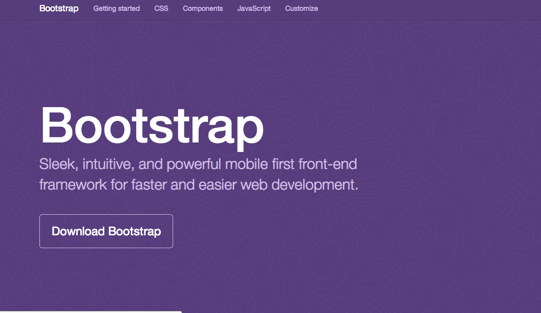
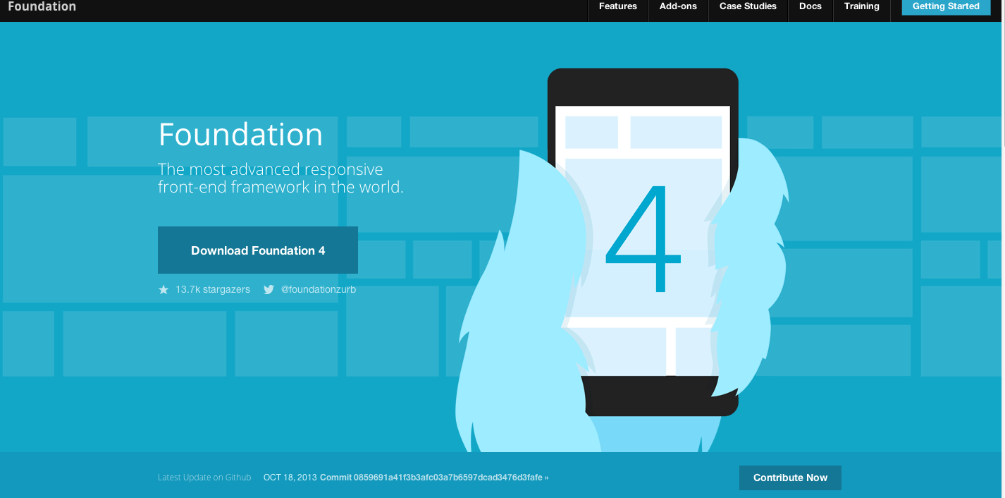
Download a pre-built framework that has basic styles already set up.

  • Fluid grids
  • Flexible images
  • Responsive media queries
  • Styles for buttons and forms, because they're a pain!
  • Lots of base styles like .pull-right, .btn, etc.

Bootstrap

By far the most popular front-end framework out there.

Download

Foundation

Another very popular framework that is just as robust at bootstrap - but in a different way.

Download

What they include

  • Fully responsive out of the box
  • Embraces Mobile First standards
  • Compiled CSS for all sorts of components
  • LESS or SASS stylesheets for rapid updates
  • Javascript for popular components
  • Pre-set styles for icons and buttons
  • Includes Glyphic icon set (awesome!)

What are the cons?

  • Default styles are ... default and not very exciting
  • Requires a fair amount of customization to make a unique looking site
  • The documentation is daunting and can be very indimidating
  • Remembering all the class names can be overwhelming

LESS & SASS?!

These are two very popular CSS preprocessors

What the what is a CSS Preprocessor?

CSS preprocessors take code written in the preprocessed language and then convert that code into the same old css we’ve been writing for years.

Since we're not writing straight CSS, we're not limited to the restrictions of the language.

What they do

  • Mixins – Classes for classes.
  • Parametric mixins – Classes to which you can pass parameters, like functions.
  • Nested Rules – Classes within classes, which cut down on repetitive code
  • Operations – Math within CSS
  • Color functions – Edit your colors
  • Namespaces – Groups of styles that can be called by references
  • Scope – Make local changes to styles
  • JavaScript evaluation – JavaScript expressions evaluated in CSS

Some highlights

Mixins!

/* LESS */ .rounded-corners (@radius: 5px) {
  -webkit-border-radius: @radius;
  -moz-border-radius: @radius;
  -ms-border-radius: @radius;
  -o-border-radius: @radius;
  border-radius: @radius;
}

#footer {
  .rounded-corners(10px);
}

  /* Compiled CSS read by the browser */
  #footer {
  -webkit-border-radius: 10px;
  -moz-border-radius: 10px;
  -ms-border-radius: 10px;
  -o-border-radius: 10px;
  border-radius: 10px;
}

Nested Rules

// LESS

#header {
  h1 {
    font-size: 26px;
    font-weight: bold;
  }
  p { font-size: 12px;
    a { text-decoration: none;
      &:hover { border-width: 1px }
    }
  }
}
/* Compiled CSS */

#header h1 {font-size: 26px;font-weight: bold;}
#header p {font-size: 12px;}
#header p a {text-decoration: none;}
#header p a:hover {border-width: 1px;}

Functions

LESS

p {
  color: lighten(@base, 5%);
}

SASS

p {
  color: hsl($hue: 0, $saturation: 100%, $lightness: 50%);
}

Variables

LESS

// LESS 
@blue: #199FD9;
p {
    color: @blue;
}
// Compiled CSS
p {
  color: #199FD9;
}

SASS

// SASS 
$blue: #199FD9;
p {
    color: $blue;
}
// Compiled CSS
p {
  color: #199FD9;
}

Survey

Please take this and help us improve future GDI classes and offerings!

Intermediate HTML/CSS Class Survey